...
...
...
...
...
...
...
...
...
...
...
...
...
...
...
...
With this feature you can:
Build, preview, and test surveys directly inside of W2H.
Include PHI-related questions in your surveys, because both the survey and the responses are securely stored directly within W2H.
Allow multiple users on the same study to seamlessly add new and edit existing surveys.
Ensure data integrity - once a participant has completed a survey, the questions on that survey cannot be deleted or edited in any way. Instead, W2H will automatically create a new survey version for you.
Create new copies of the survey with the 'Duplicate Survey' button.
Explore:
| Table of Contents | ||||
|---|---|---|---|---|
|
How can I start building a new survey?
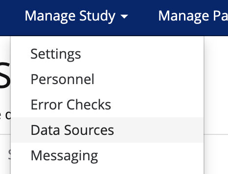
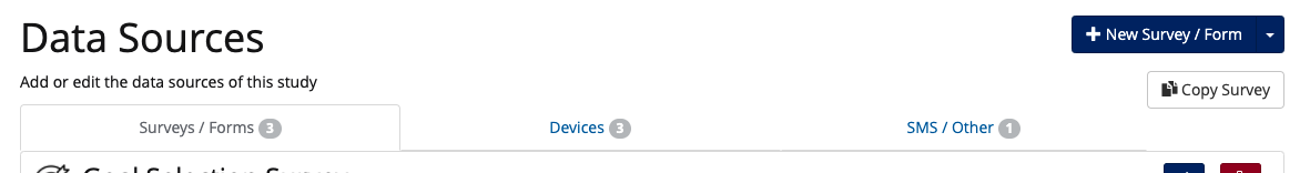
Navigate to the Data Sources drop-down under Manage Study
Click New Survey/Form
Name your survey and start building!
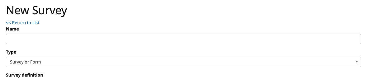
When you’re done building, make sure to click the blue Add button at the bottom of the page.
How do I use the Survey Builder?
The survey builder contains the following features:
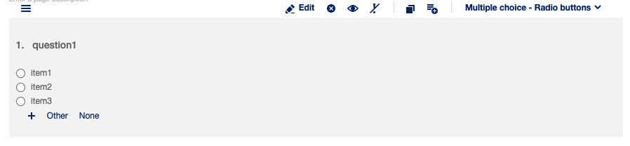
Toolbox - this is where you select your question type. All that you have to do is click on the new question type and it will be added to your survey.
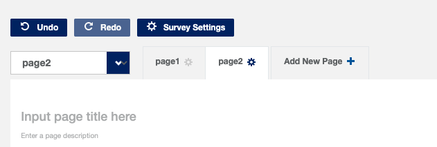
Undo and Redo - accidentally delete a question? you can revert back with these buttons.
Add a new page - includes page breaks in your survey.
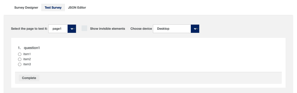
Test Survey - preview survey questions and answers and practice completing a survey like a real participant.
...
Drag and drop or click on the question type to add a new question. Once the question is added to the survey, click the Edit button to edit the question name, question text, and answer choices (if applicable).
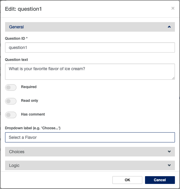
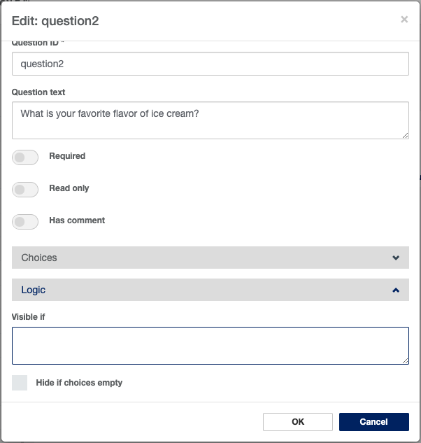
The edit screen will appear. From here you can update the Question ID and Question Text.
Question ID is how the question will be identified in results/datasets, and Question Text is the way the question itself will appear to participants.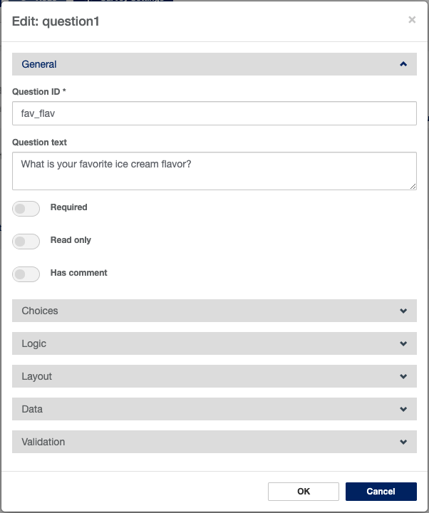
You can also use this view to toggle answer requirement on and off.Open the Choices panel to add answer choices and coding if your question type requires them.
Please note: this panel exists for multiple-choice question types only. Further details on all question types can be found below.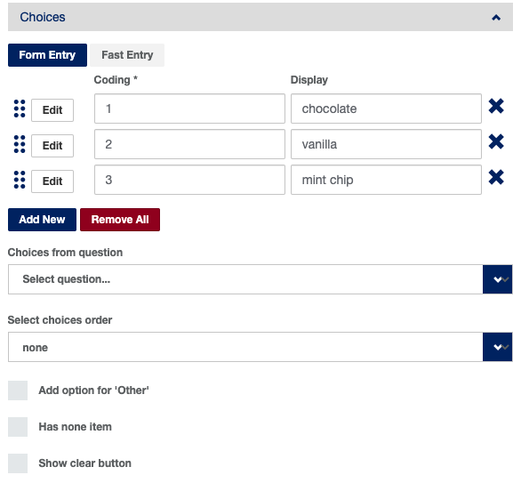
You can also use this panel to add ‘Other’ or ‘None’ options, and to determine the order your answer choices should appear. Answer choices can also be dragged and dropped to reorder.
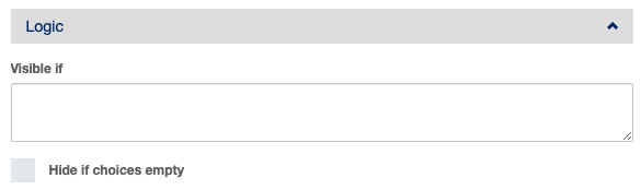
The Logic panel can be used to indicate if the question should appear, based on the participant’s response to previous questions. More on this below, in the section Branching/Skip Logic.
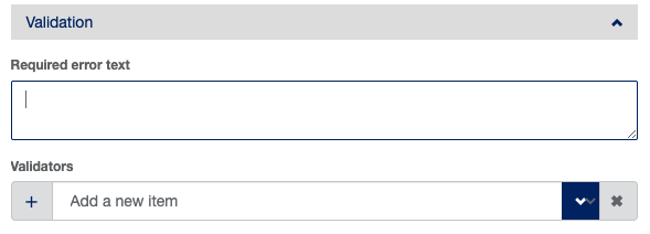
The Validation panel can be used to add restrictions around the format of answer text, among other things.
Use the Add New Page button to break up your survey into page views. This can be useful when using branching logic or creating surveys that contain multiple definable sections/validated instruments
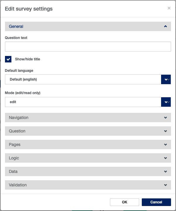
The Survey Settings button opens a panel that can be used to modify global settings for the survey, such as question numbers, navigation button text, completed page text, and more.
The Test Survey feature can be used to preview the survey as it will appear to a participant, and to test branching logic.
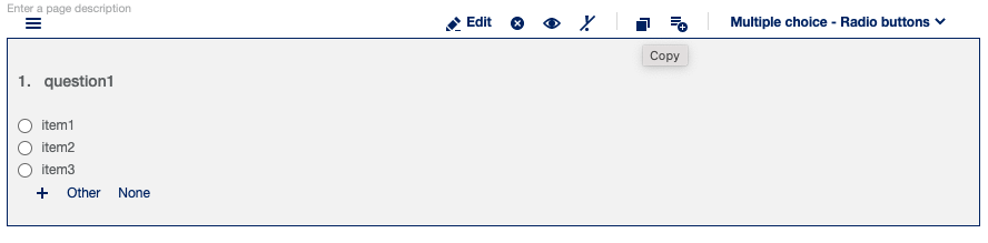
Questions can be moved around by dragging and dropping them within the survey builder space. They can also be copied or duplicated using the Copy button at the top of the question.
What are the different question types?
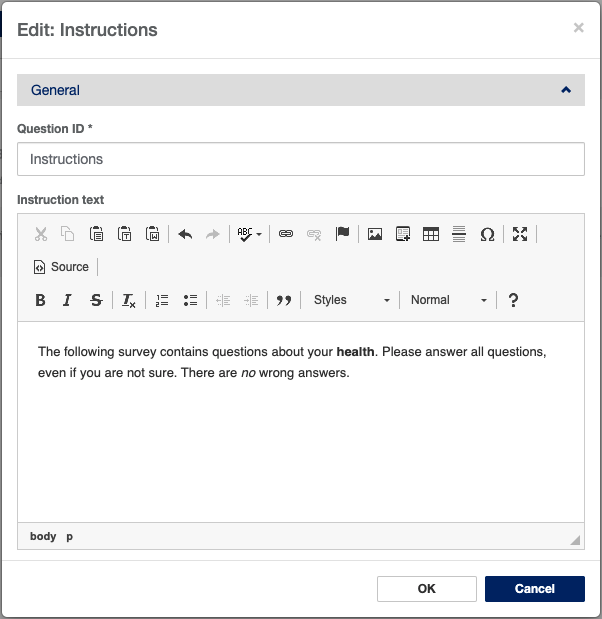
Instruction Text: used to include instructional text or an explanation of the survey. The text editor for this question type allows for formatting like font size, bold, italics, etc.
...
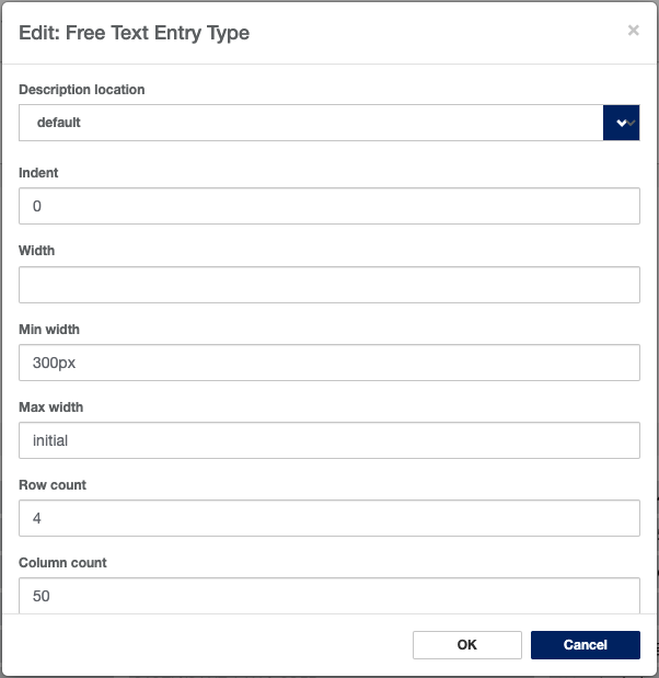
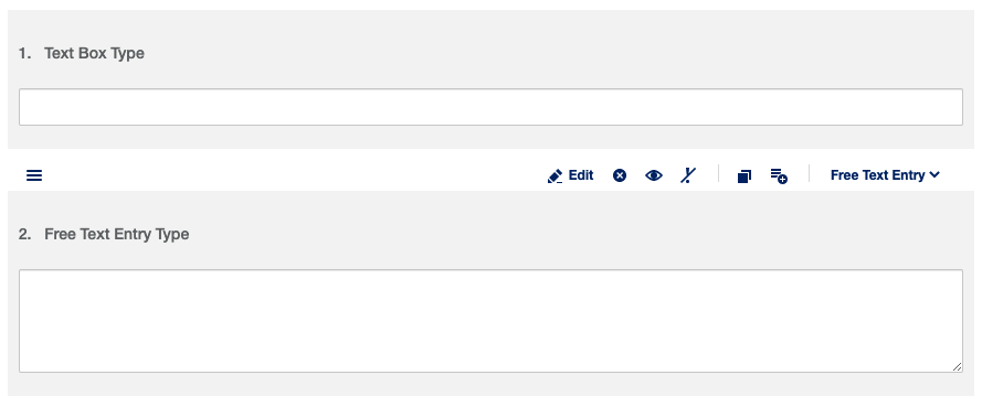
Free Text Entry: best question type for a longer free text answer type. This question type is set up similarly to the Text Box question type, except that it does not allow for pre-set validation types. One other notable difference is that you can pre-set the number of rows of text allowed in the answer box, to limit answer length. This setting is found in the Layout panel.
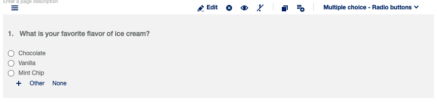
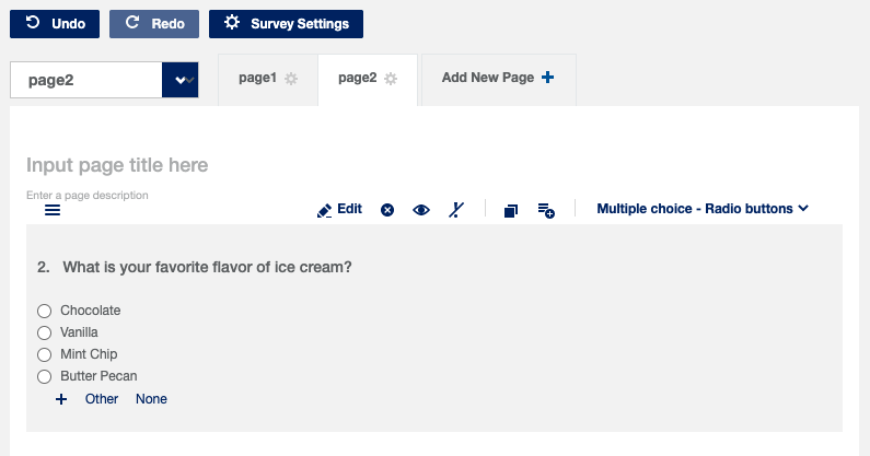
Multiple Choice - Radio Buttons: multiple choice question type that allows for one answer and defaults to displaying choices. See How do I use the Survey Builder? for more information about setting up this question type.
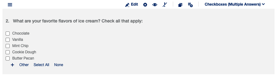
Multiple Choice - Checkboxes: multiple choice question type that allows for more than one answer and defaults to displaying choices. The setup for this question type is identical to the setup for Multiple Choice - Radio Buttons.
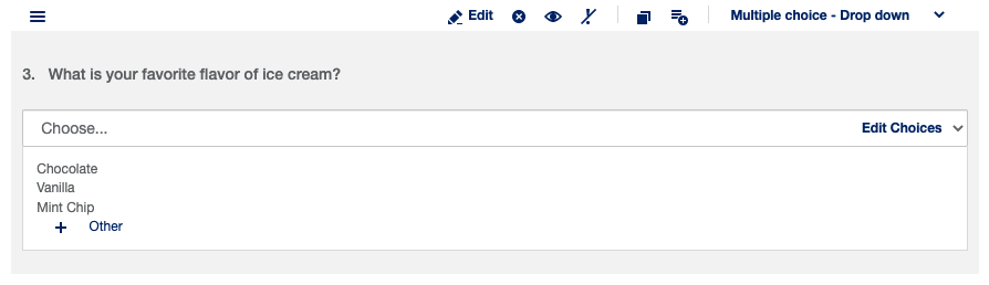
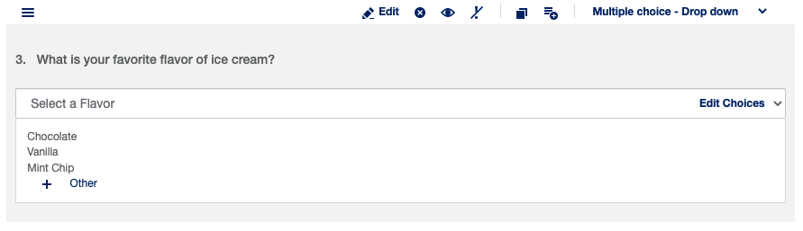
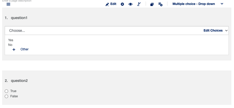
Multiple Choice - Drop Down: multiple choice question type that allows for one answer and defaults to hiding choices. The setup for this question type is identical to the setup for Multiple Choice - Radio Buttons. The label for your drop-down will default to “Choose…” If you would like to set another label, you can do so under the General panel.
True/False and Yes/No: multiple-choice question types that are preset with common answer choices. The setup for this question type is identical to the setup for Multiple Choice - Radio Buttons. These question types can also be configured as either radio buttons, checkboxes, or drop-downs. There is no functional difference between using one of these question types and using another multiple-choice question type - they can just save you some time by having answer choices already pre-filled.
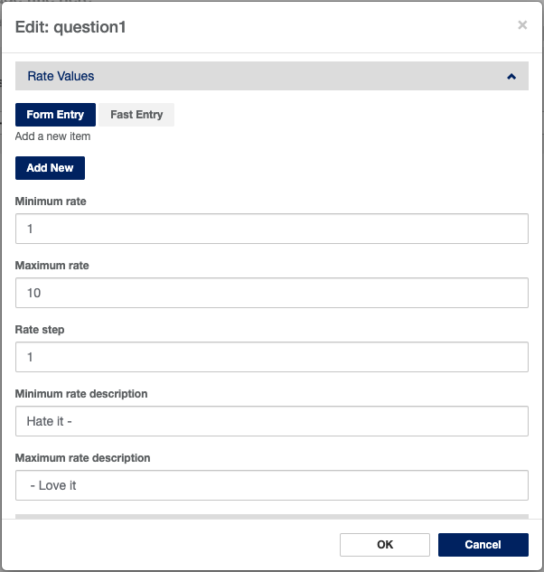
Numeric Scale: question type for administering a point-and-click Likert scale question.
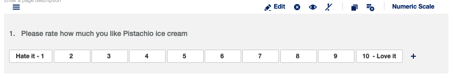
You can edit the appearance and values on the scale under the Rate Values panel.
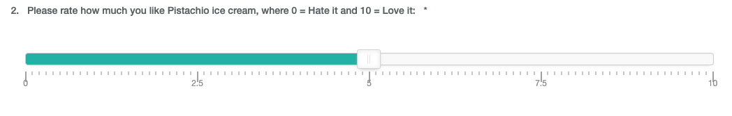
Slider Scale: question type for administering a more nuanced visual analog scale question. This question type allows the user to drag a “slider” along a scale, rather than clicking a value.
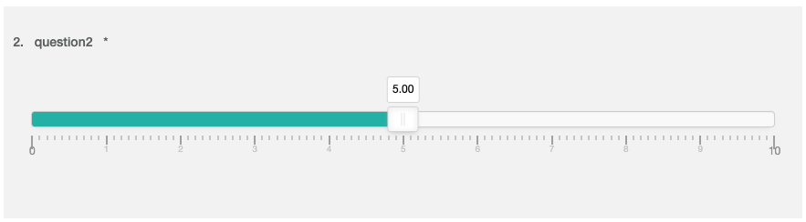
This is how the slider question will appear as default. However, there is quite a bit of customization available for this question type. Most of it can be found under the Slider panel in the edit window:
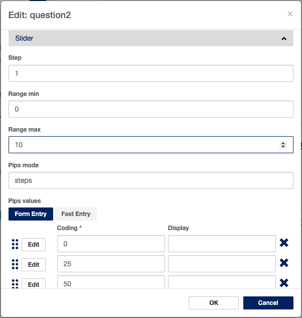
The Step field is used to determine what the increments between possible answers are. It defaults to 1 so that the participant can only move the slider in increments of 1; however, it can be set to anything. If you wanted to do a 1-10 scale with 100 possible increments, you could set the Range min to 0, the Range max to 10, and the Step field to 0.1. That would make your slider look like this:
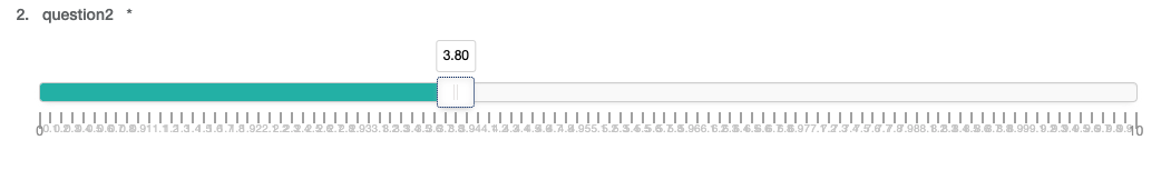
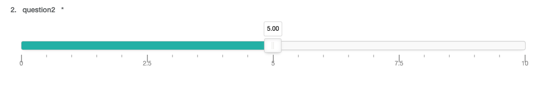
Each 1/10th of a point being labeled makes the slider look a bit crowded. We can fix that by setting the Pips mode field to ‘positions,’ instead of the default ‘steps':
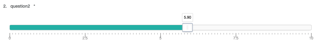
The next customization to explore is the Pips density field, which determines whether there is a little tick mark along the line for each step, for every 2 steps, etc. The value defaults to 1, but this is what it would look like with a value of 5:
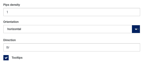
Finally, you have the option to remove the floating value indicator above the slider. You can do this by unchecking the Tooltips box at the bottom of the Slider panel:
 Tip! There can be some issues with the display of this question type on mobile devices. We recommend using a multiple-choice question instead, as it will display the values vertically. You can also change the orientation of the slider to vertical by opening the Slider panel in the edit window and selecting “vertical” from the drop-down.
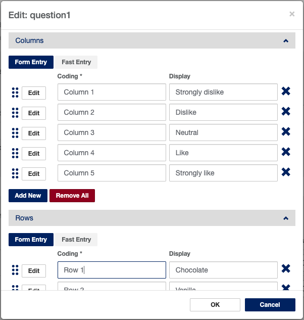
 Matrix - Radio Buttons: asks a participant multiple questions of the same format within a single question. This question type allows for one answer in each row.
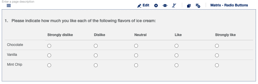
The display and coded values for each row and column can be edited under their respective Rows and Columns panel in the edit window. They are set up similarly to how the choices are set up for any other multiple choice type question.
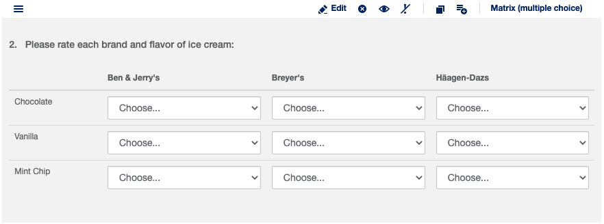
Matrix - Multiple Choice: asks a participant multiple questions of the same format within a single question. This question type allows for one answer for each intersection of Row and Column.
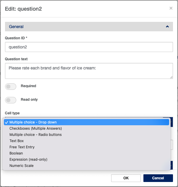
There is some flexibility to the answer selection format for this question type. Under the General panel in the edit window, the Cell type field allows you to explore these options.
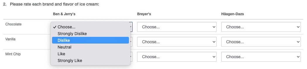
By default, this question type will appear with drop-down choice panels at each intersection. Remember that you’ll need to set values for the rows, columns, and answer choices.
Signature Pad: this question type allows the survey to capture a handwritten, digital signature for the participant. This is most useful for projects that plan to have participants complete surveys on a touchscreen device, though it can be signed with a computer mouse as well.
Tip! This question type can be used for Informed Consent content!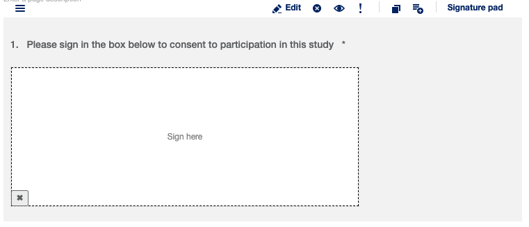
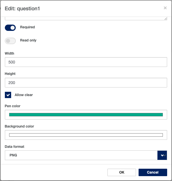
Customizations to this question type include the dimensions of the signature box, the pen color, and the background color. All of these can be found in the edit window under the General panel:
How do I use branching/skip logic in my survey?
Branching logic, sometimes called display or skip logic, can be used to customize what a participant sees in their survey based on a variety of factors. We might only want question #2 to display if the participant answers “Yes” to question #1, or we might want a certain page of the survey to only display if the participant’s global variable is set to a specific value.
...
At the top of the Survey editor, click the Add New Page + tab next to the current page.
Add a question.
Navigate to the Logic panel in the edit window.
Using a very basic formula, you can define when the question you are editing gets displayed. Simply enter the question's QuestionID in curly brackets, then use an operator such as the 'equals' sign followed by the valid response code in single quotes.
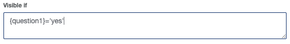
You can also use AND/OR and other operators in your formula
Tip! If you have questions about how to write expressions for display logic, see the Using Display Logic in Surveys page.
What happens if I need to update a survey after study launch?
There are two scenarios after study launch.
...